my spam......I basically had a really old comic I started in 2008, I totally changed a lot about it many new characters were added in 2011. I actually started writing the main story twice, of course it was a huge failure in art.
I was huge japanese fan, so all the characters were japanese in 2008, when I started, and later I gout totally out of this and become so nordic fan, the new characters basically finnish, swedish, norwegian, but also some other characters are from other countries appears here. I need to change so the school became a japanese international school with many exchange students and so on.
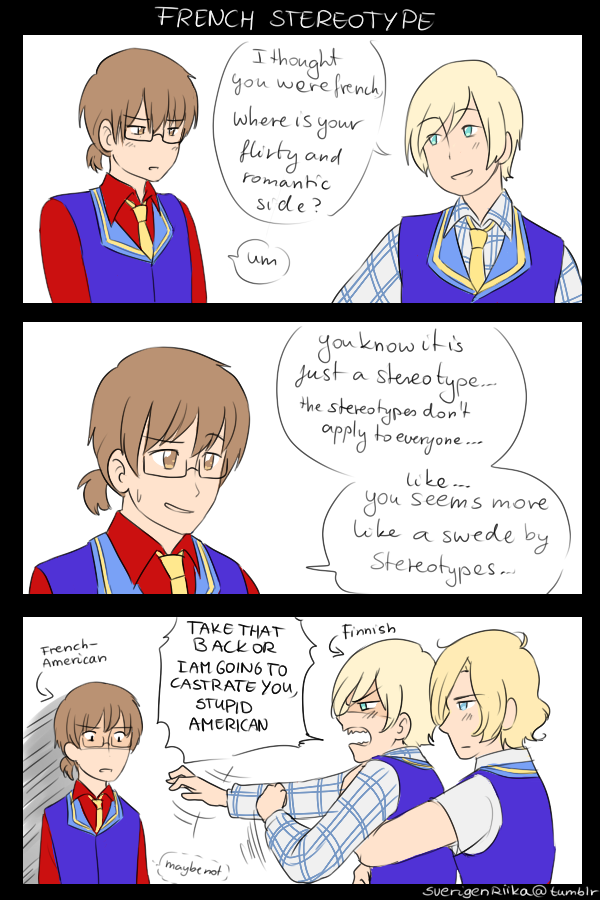
I don't think I could even start a full story comic with it, and sometimes I loose interest on that, but I enjoy doing many random one-page comics with them like this:

(brownhaired is Jacques Wilson Francois, the finnish one is Mikaela Suomalainen, the other blonde is Kristian Thomassen)
and I never could continue the started comics because of the huge improvements and/or style changes after a long break
I actually have a website where I posted all the finished pages, and have a tumblr page
have all the characters in spoiler:
I am sorry for spam and selfpromotion here.... I can delete if you want.
This looks really interesting

I love the diversity you have with the characters!
Feartheviolas, those sketches are really good! That wall-e is so cute~
here a lil something I made for my sister, who wanted me to draw something to her but gave me free reigns as to what...so I came up with this cave-thing 
Oh and, that lil creature looking up towards the light is Sniff  my sister's idea

The lightning is beautiful!

I say why not? I wouldn't want to miss seeing good art! I've been to comment on your art, but the thread was moving way too fast haha.
First things first, I'm happy to see someone familiar with KHR. Hardly a favorite, but I liked the concept a lot.
For someone who hasn't really done BG for a long it looks quite good! I really liked what you did with the flames! All of those details makes the fire look epic *v* If there's one thing I think you could improve on it's the lighting; Gokudera seems very close to the flames, so I believe that orange lighting on him should be stronger.
Overall, I really like it 
Here's last month and today's junk:

Some environment and profile practice!

Headshots, because I love headshots of my babies.
Characters from left to right- first row: Kwen, Kimval, Dorina
Second row: Aisleen, Nait, Hurao
Third row: Lamiya, A'almas
Weird name spelling (and pronunciation) because of my conlang.
Thank you so much for the feedback!

KHR (manga version) is one of my favorites, despite the weaker moments it had

I've been neglecting it since it ended though. I was so angry about the ending back then, but now that I re-read it I thought it was a lot better.
For the flames I actually went through all of the brushes that comes with ps elements 8 trying to find a nice one ^w^ I can totally see what you mean with the lightning. I had intended for the explosion to be a little further back, but I failed with that

I actually thought of adding more shades to his face as well since it ended up being closer.
I like how you have worked with the colors in the three profile pictures! I'm rather bad at colors and ligthning in that way, but I didn't even reflect on the character having different skin tones at first (it reminds me of how Minna changes the chapter colors in such a natural way).
I like the headshots of your characters, they seem very full of life

Are they from a story of yours?

