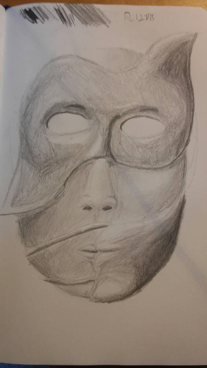
unwary: I like the mask, but it looks like it's sitting very high on the head (if i'm correct, the top of the head should be near the bottom of the 3rd "bubble" from top). Also, it has no eye-holes D: your shadows and highlights look stronger than the last drawing (maybe because there, they partly doubled as sketch-line) but still pretty bland. Don't be afraid to use much darker tones, including black. Actually I know I tend to do that too, my solution is to put the darkest tone early on, and make it *really* dark, so I'll be forced to get more into higher values.
Anyway, I should start from a grey background next time I do a digital thing, looks like a smart thing to do
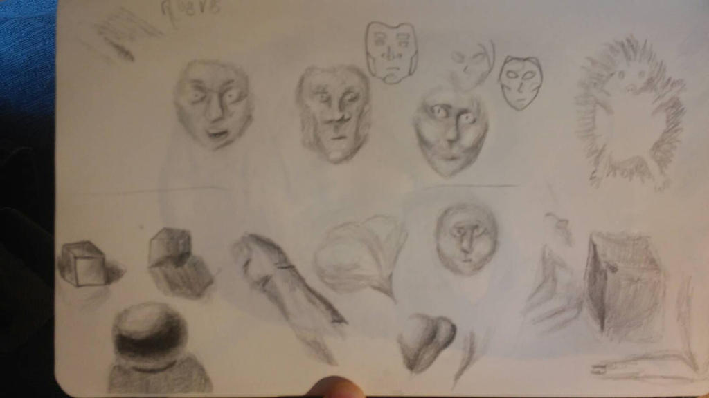
as promised, here's my value-practice
 (also I put them on a DeviantArt account, so I could upload directly from phone and I can find them back, too)
and here's the mask:

(yeh, I know, the skin shading is kinda half-assed, and the texture of the top-mask doesn't look very good at all but hey, practice!)
that's done with a HB pencil btw
-_-_- edit so as not to doublepost -_-_-for the next themed practice, may I suggest either faces (because obviously we can never practice anatomy enough) or !!!panel re-draws!!! (because haiz made it look like a good idea in the Art Museum)
and if you want to join in on this, it's
now or never! (or later, we'll take you with anyway)