Poll

Best Start Date for you (Please vote for as many as you'd participate in)

May 15-ish
9 (13.4%)
June 1-ish
13 (19.4%)
June 15-ish
16 (23.9%)
July 1-ish
19 (28.4%)
Later
10 (14.9%)

Total Members Voted: 23

Author Topic: Art Discussion  (Read 68767 times)

callipygous

  • Newbie
  • *
    • Tumblr
    • DeviantArt
  • im gonna appropriate bro culture and make it gay
  • Preferred pronouns: she/her+they/them
  • Posts: 77
Re: Art tutorials!
« Reply #345 on: December 13, 2015, 09:37:52 PM »
IM HERE FROM FINALS HELL TO DROP A TUTORIAL ON COLORS AND SHADING AND DESIGN

THEYRE 3 SEPARATE FILES!! YOU CAN ASK ANY QUESTIONS YOU HAVE ILL DO MY BEST TO ANSWER THEM
ILL BE FULLTIME BACK BY THURSDAY HOPEFULLY!!!

Curry

  • Ruler of a Derelict Airport
  • *****
    • Tumblr
    • DeviantArt
  • [musically] IB IS KILLIN ME
  • Preferred pronouns: they/them/theirs
  • Posts: 1783
Re: Art tutorials!
« Reply #346 on: December 13, 2015, 09:54:02 PM »
IM HERE FROM FINALS HELL TO DROP A TUTORIAL ON COLORS AND SHADING AND DESIGN
[snop]
THEYRE 3 SEPARATE FILES!! YOU CAN ASK ANY QUESTIONS YOU HAVE ILL DO MY BEST TO ANSWER THEM
ILL BE FULLTIME BACK BY THURSDAY HOPEFULLY!!!

LMAO I LOVE YOUR TUTORIALS.... they're always hilarious wiTH REALLY GOOD POINTS please continue to make all the tuts
YEET

Aierdome

  • Ranger
  • ****
  • The Emperor Protects.
  • Posts: 621
Re: Art tutorials!
« Reply #347 on: December 14, 2015, 10:24:59 AM »
IM HERE FROM FINALS HELL TO DROP A TUTORIAL ON COLORS AND SHADING AND DESIGN
(snip)
THEYRE 3 SEPARATE FILES!! YOU CAN ASK ANY QUESTIONS YOU HAVE ILL DO MY BEST TO ANSWER THEM
ILL BE FULLTIME BACK BY THURSDAY HOPEFULLY!!!

Wow! That's super-helpful. Thank you!

So, I need abut of help with drawing trolls...
Anyone got any advice?
You mean scandinavian trolls or SSSS trolls?  ;)


« Last Edit: December 14, 2015, 01:21:55 PM by Aierdome »
When I think of deep psychological insight, I think of three names: Freud; Jung; Grignr.
-----
:chap6: :chap7: :chap8: :hat: :chap9: :chap10: :chap11: :book2: :chap12: :chap13: :chap14: :chap15: :chap16:

Krisse Kovacs

  • Ruler of a Derelict Airport
  • *****
    • Tumblr
  • MARTTI, he/him
  • Preferred pronouns: he/him
  • Posts: 1475
Re: Art tutorials!
« Reply #348 on: December 14, 2015, 03:11:51 PM »
I am laughing here because I am weird and I think I am funny
on the colouring tutorial, you say a colour for base for skin and choose some greenish shade for shading and say no, and redish as yes, then add the green is wrong because it will make your character look dead

WHAT IF THAT IS MY AIM ON MY ART TO MAKE THE CHARACTER LOOK DEAD.
it could be saying something like "it makes the character looks dead, don1t use it, unless you want them dead"

just saying.

but also the shadow could be different by lights and the reflection of our surroundings, but I guess those are kind of advanced shading...
can speak :hungary::uk: used to learn :germany: is learning :sweden::finland: can read a bit :norway::denmark: want to learn :iceland:
survived :chap8: - :chap9: - :chap10: - :chap11: - :chap12: - :chap13: - :chap14: - :chap15: - :chap16: - :chap17: - :chap18: - :chap19: - :chap20:

callipygous

  • Newbie
  • *
    • Tumblr
    • DeviantArt
  • im gonna appropriate bro culture and make it gay
  • Preferred pronouns: she/her+they/them
  • Posts: 77
Re: Art tutorials!
« Reply #349 on: December 14, 2015, 04:14:52 PM »
I am laughing here because I am weird and I think I am funny
on the colouring tutorial, you say a colour for base for skin and choose some greenish shade for shading and say no, and redish as yes, then add the green is wrong because it will make your character look dead

WHAT IF THAT IS MY AIM ON MY ART TO MAKE THE CHARACTER LOOK DEAD.
it could be saying something like "it makes the character looks dead, don1t use it, unless you want them dead"

just saying.

but also the shadow could be different by lights and the reflection of our surroundings, but I guess those are kind of advanced shading...
of course thats something you can do?? i am not forbidding it nor am i any kind of authority on color, but in the context of the tutorial, the example, and how many characters and ocs people draw are "living", i decided to show how the norm would probably be. by all means use greens and purples and blues to shade however many dead or sickly characters you want, im not stopping you. reds and pinks are generally used more liberally because of the blood beneath the skin giving it that color, rather than cooler tones that would be more appropriate for zombies. im definitely not saying dont use it - it was an example wherein the subject was not meant to look sickly, so i chose the appropriate palette. shade as you please for however you see fit, my tutorial is not the sole way to do things
and yes, shadows fall differently on the face and show different structures depending on light source, environment, refracted light and ambient light. i was demonstrating a more natural shading, meant to showcase color rather than dramatics. it may seem difficult, but there are plenty of tutorials out there that teach more advanced ways to shade, its just a matter of finding them and experimenting with them

EDIT: this might help:

the 'green' shade was just a darker shade of the base. the ones i used to shade involved moving the hue, which was the entire point i was making in the tutorial. many artists just use a darker shade of their base for shadows, but changing the hue to shade will make pieces more interesting and give them more depth and visual interest
« Last Edit: December 15, 2015, 12:48:19 AM by callipygous »

Athena

  • Admiral of a Sunken Ship
  • ******
  • previously Luth Nightbreeze
  • Preferred pronouns: she/her
  • Posts: 2682
Re: Art tutorials!
« Reply #350 on: December 15, 2015, 01:27:06 AM »
Wow! That's super-helpful. Thank you!
You mean scandinavian trolls or SSSS trolls?  ;)
SSSS trolls, of course! ;)
tired programmer girl with stories in her head and magic in her heart

currently working on a video game/digital novel called Keeper of the Labyrinth<3

avatar from the now-unavailable webcomic Prague Race

Gwenno

  • Valkyrie
  • Ruler of a Derelict Airport
  • *
    • Tumblr
    • DeviantArt
  • Be the change you wish to see
  • Preferred pronouns: she/her
  • Posts: 1241
Re: Art tutorials!
« Reply #351 on: December 15, 2015, 07:10:48 AM »
SSSS trolls, of course! ;)

I hardly think I'm a competent enough artist to actually post a tutorial, but seeing as nobody else has produced anything else I'll show you how I go about designing trolls (if nothing else, I've drawn and designed a fair few of these lovelies over the last year), and who knows, maybe it will help? Just a quick thing, I'm a bit too busy to produce works of beauty atm :P Also, each troll is different, but these things I'm saying are generally true across the board as far as my own drawing experience goes. I also didn't mutate this one too far because I wanted there to be a strong resemblance to the original skeleton picture. Erm, yeah, that's probably enough rambling and excuses. Hope it helps at least a little >"<

Spoiler: show

Start off with what's under the skin with a healthy human/animal. Understanding how the skeletons and muscles work will let you modify them more realistically. I liked to go to the local museum and sketch the skeletons, taxidermy and curiosities there before designing anything when I started drawing trolls, and I would definitely extend this advice to anyone wanting to be likewise creative. This picture was just one of the first results on google when I typed "human skeleton"
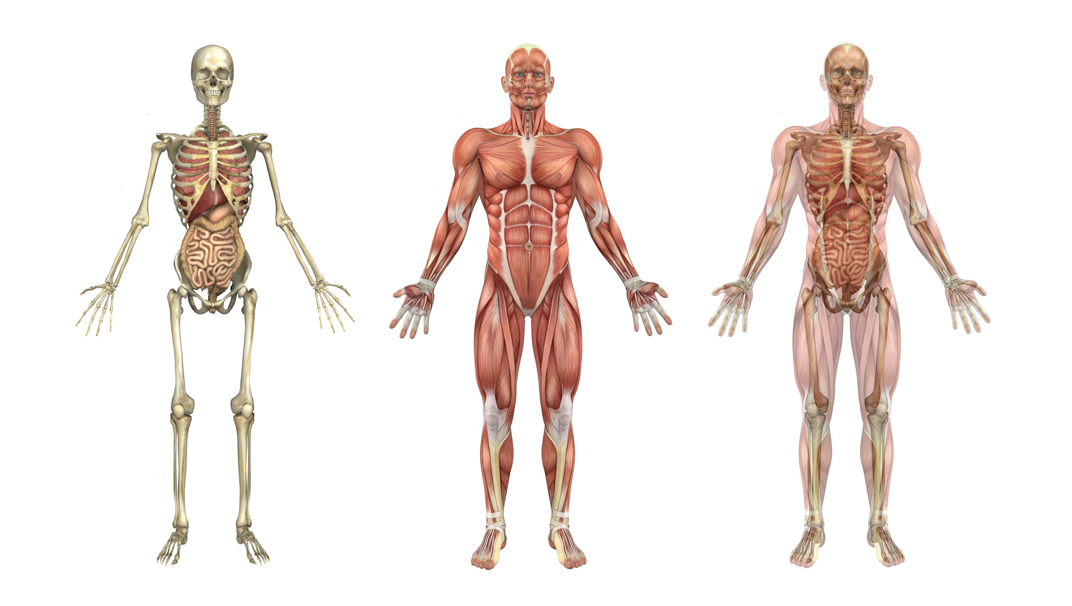
How will you change the bone structure? I've extended a few parts of bone which are naturally more protruding, changed the skull shape to make the mouth bigger and changed the angle at which the legs attach to the body which would give this troll a more ape like gait. I'm also making wing like flaps, just because why not :P I also like to turn fingers and toes into claws, and elongate teeth because these *are* monsters after all  ^-^

Brownish and purpe-ish colours for the flesh, and a dirty cream for the bones are what I usually stick by. The bones don't need to show of course, but remember when they do show that it's the muscles which move the body so you can't have entirely bone limbs if you want them to move, at least have a little flesh attached to it ^_^


Draw where you envision the muscles fitting in. Look at the normal muscles picture and imagine how they will need to change to adapt to the new bone structure. This is a super rough estimation, but I find it helps a lot, and it helps me imagine how the troll moves


Some darker colours. Blue/green give it a dead-ish look as mentioned in the previous tutorial and comment, and gives a nice bruised rotten feel to it. This isn't so much shading due to light, but where the bones are rubbing and the flesh and skin is thin and sick. Some darker icky brown to the bones which are visible.


Some veins and arteries in dark reds and blues as well as. Darkest around where the bones are protruding, and generally otherwise around where they'd naturally appear on a person :)


.... I am probably going to regret posting this very soon........
You're a fool if you dance or not so you might as well dance

Fluent: :wls: :gb:
駄洒落だけ: :jp:
Working on it :nl:
Tourist level: :es: :fr: :it:

Chapter break survivor : :artd: :book1+: :book2: :chap12: :chap13: :chap14:
Soulcount: 10

proud member of the Sigrun Eide for God-Emperor of the Universe Society
Roleplay doc

Athena

  • Admiral of a Sunken Ship
  • ******
  • previously Luth Nightbreeze
  • Preferred pronouns: she/her
  • Posts: 2682
Re: Art tutorials!
« Reply #352 on: December 15, 2015, 11:34:15 AM »
I hardly think I'm a competent enough artist to actually post a tutorial, but seeing as nobody else has produced anything else I'll show you how I go about designing trolls (if nothing else, I've drawn and designed a fair few of these lovelies over the last year), and who knows, maybe it will help? Just a quick thing, I'm a bit too busy to produce works of beauty atm :P Also, each troll is different, but these things I'm saying are generally true across the board as far as my own drawing experience goes. I also didn't mutate this one too far because I wanted there to be a strong resemblance to the original skeleton picture. Erm, yeah, that's probably enough rambling and excuses. Hope it helps at least a little >"<

Spoiler: show

Start off with what's under the skin with a healthy human/animal. Understanding how the skeletons and muscles work will let you modify them more realistically. I liked to go to the local museum and sketch the skeletons, taxidermy and curiosities there before designing anything when I started drawing trolls, and I would definitely extend this advice to anyone wanting to be likewise creative. This picture was just one of the first results on google when I typed "human skeleton"

How will you change the bone structure? I've extended a few parts of bone which are naturally more protruding, changed the skull shape to make the mouth bigger and changed the angle at which the legs attach to the body which would give this troll a more ape like gait. I'm also making wing like flaps, just because why not :P I also like to turn fingers and toes into claws, and elongate teeth because these *are* monsters after all  ^-^

Brownish and purpe-ish colours for the flesh, and a dirty cream for the bones are what I usually stick by. The bones don't need to show of course, but remember when they do show that it's the muscles which move the body so you can't have entirely bone limbs if you want them to move, at least have a little flesh attached to it ^_^


Draw where you envision the muscles fitting in. Look at the normal muscles picture and imagine how they will need to change to adapt to the new bone structure. This is a super rough estimation, but I find it helps a lot, and it helps me imagine how the troll moves


Some darker colours. Blue/green give it a dead-ish look as mentioned in the previous tutorial and comment, and gives a nice bruised rotten feel to it. This isn't so much shading due to light, but where the bones are rubbing and the flesh and skin is thin and sick. Some darker icky brown to the bones which are visible.


Some veins and arteries in dark reds and blues as well as. Darkest around where the bones are protruding, and generally otherwise around where they'd naturally appear on a person :)


.... I am probably going to regret posting this very soon........

Thank you so much, this is just what I need! I do have a pretty basic understanding of human anatomy and I knew it should be based somewhat off that but I wasn't really sure how to start and this really helped. :)
tired programmer girl with stories in her head and magic in her heart

currently working on a video game/digital novel called Keeper of the Labyrinth<3

avatar from the now-unavailable webcomic Prague Race

frenci

  • Safe-Zone Citizen
  • **
    • Tumblr
    • DeviantArt
  • too lazy to type, too shy to talk
  • Posts: 156
Re: Art tutorials!
« Reply #353 on: January 08, 2016, 04:09:20 PM »
like i promised here s a tutorial
is not a whow to animate one, but a how to save as gif and ho i do pixel arts
i will do a how toanimate one tho ^^
i better warn you i saund verry akward
but i know that next time i shal do better! (the question is how much next it will be)
Talks: :italy: :uk: :slovenia:
Learning: :spain: :norway:

mithrysc

  • Ranger
  • ****
  • indefinite hiatus
  • Posts: 806
Re: Art Supply Discussion Thread
« Reply #354 on: January 08, 2016, 10:21:10 PM »
People who use markers: does anyone have any recommendations for alcohol-based markers that are somewhat reasonably priced?

Sc0ut

  • Ruler of a Derelict Airport
  • *****
    • Tumblr
  • Posts: 1077
Re: Art Supply Discussion Thread
« Reply #355 on: January 09, 2016, 07:32:36 AM »
I randomly wandered to this thread and saw the old tablet discussion and just dropping my 2c in (hopefully I won't bury mithrysc's question, that I have no answer for).

I'm a professional artist and I was lucky enough to test all kinds of Wacoms, including a Cintiq, at work. Not to rain on your parade guys, but I didn't like the Cintiq and swapped it for my old Intuos after a couple of weeks. Ergonomics is really important to me, if something makes me work in a position where I'm sore after a couple of hours, I fling it out the window. And the Cintiq did just that. My lower back and right shoulder were bust after a day's work. Whatever advantage the Cintiq might have (it is a bit faster/more intuitive/more comfortable to work on the screen directly) it just isn't worth it for me if I can't use it a whole day without hurting my body. The difference anyway is really small. It's not like my art or speed improved massively while working with it. Now I work from home and use a tiny Bamboo and it actually has all I need (though the extra buttons on the Intuos were useful too when I had them - just not vital). I wouldn't switch it for a Cintiq!

This isn't the case for everyone. My work mates actually kept their Cintiqs though they complained about back aches too. Just something to consider if you care about your body as well as your art. Ideally you should try to test one (for at least a day, not just a few minutes) before buying it, to see if it's right for you.
« Last Edit: January 09, 2016, 07:34:36 AM by Sc0ut »

taybee

  • Newbie
  • *
    • Tumblr
  • Emilalli Enthusiast
  • Posts: 21
Re: Art Supply Discussion Thread
« Reply #356 on: January 17, 2016, 01:47:10 AM »
I randomly wandered to this thread and saw the old tablet discussion and just dropping my 2c in (hopefully I won't bury mithrysc's question, that I have no answer for).

I'm a professional artist and I was lucky enough to test all kinds of Wacoms, including a Cintiq, at work. Not to rain on your parade guys, but I didn't like the Cintiq and swapped it for my old Intuos after a couple of weeks. Ergonomics is really important to me, if something makes me work in a position where I'm sore after a couple of hours, I fling it out the window. And the Cintiq did just that. My lower back and right shoulder were bust after a day's work. Whatever advantage the Cintiq might have (it is a bit faster/more intuitive/more comfortable to work on the screen directly) it just isn't worth it for me if I can't use it a whole day without hurting my body. The difference anyway is really small. It's not like my art or speed improved massively while working with it. Now I work from home and use a tiny Bamboo and it actually has all I need (though the extra buttons on the Intuos were useful too when I had them - just not vital). I wouldn't switch it for a Cintiq!

This isn't the case for everyone. My work mates actually kept their Cintiqs though they complained about back aches too. Just something to consider if you care about your body as well as your art. Ideally you should try to test one (for at least a day, not just a few minutes) before buying it, to see if it's right for you.

I've heard of some people not liking them, so it probably just depends whatever is comfortable for you! In my case my desk has a pull-out drawer where they keyboard usually sits- I put my tablet here instead, and use the stand to make it sit at a pretty steep angle so I can lean back in my chair while i draw versus leaning over the tablet (which DOES start to hurt!)
(I'm also curious- what do you do for work??:O )

As for the marker question- I haven't tried anything but copics, but i've heard Prismacolor has a similar type of marker that might be cheaper?

TicTac

  • Newbie
  • *
  • I am a happy little TicTac
  • Preferred pronouns: She/her
  • Posts: 79
Re: Art Supply Discussion Thread
« Reply #357 on: January 17, 2016, 03:13:56 AM »
How did I not see this thread before. I love art, though I'm not the best at it, I do Visual Art as a subject in school.

But anyway, my art supplies I shall talk about, because I'm super excited about them. For Christmas, I got an AMAZING art kit. It had watercolour paints, oil paints, and acrylic paints. As well as watercolour pencils, three different brushes for each set of paints, two canvases, a watercolour pad, a collapsible easel, and it is beautiful. I haven't finished anything yet, though I've been experimenting with the watercolours, and I've made plans for an oil painting. But it's  the best thing I've ever seen in my life, art supply wise. It's beautiful.
Fluent: :australia:
Know a few phrases: :china:
Know random words: :germany: :spain: (thanks Dora)
Want to learn, eventually: :finland:
Survived :chap10: :chap11: :chap12: :chap13:

Silenter

  • Safe-Zone Citizen
  • **
  • So sorry.
  • Posts: 211
Re: Art Supply Discussion Thread
« Reply #358 on: January 31, 2016, 06:31:11 PM »
I have an Intuos Creative Pen and Touch small tablet, which I got for $100. Pretty good, except I ran into the problem of the nib becoming sharp at the point like where the pencil is the most sharp after you fully sharpen it. But other than a few scratches getting on there, it's pretty good. I haven't had any other tablet before it.

I have only considered the portable Cintiq, and not the full on 24HD ones and such.

Half-crumbled I guess: :southkorea:
Main language: :usa:
:chap2: :chap3: :chap4: :chap5: :chap6: :chap7: :chap8:

Unlos

  • Ruler of a Derelict Airport
  • *****
    • Tumblr
  • Posts: 1490
Re: Art Critique Thread
« Reply #359 on: February 17, 2016, 05:07:13 AM »

Agh, downloaded sculptris to play with. And it is fun! But very different! I'm trying to sculpt Reynir, and am in unknown territory. I like the nose. But that chin is a lot more forward than a chin should be. More may follow.