Author Topic: The Forum's Art Museum  (Read 464653 times)

wavewright62

  • Valkyrie
  • Conqueror of an Abandoned City
  • *
    • Tumblr
  • Preferred pronouns: she/her
  • Posts: 5031
Re: The Forum's Art Museum
« Reply #2640 on: March 27, 2021, 04:24:49 PM »
Jumping on the love pile, that's utterly amazing! (Well worth the GB load imo)
Always a newbie at something
Native speaker: :us:
Acquired: :nz:
Grew up speaking but now very rusty: :ee:


Ruler of Queenstown Airport (Thanks Purple Wyrm, I will wear my wings with pride)
Admiral of the Sunken Rainbow Warrior

moredhel

  • Ranger
  • ****
    • DeviantArt
  • Preferred pronouns: happy with any of them except it
  • Posts: 619
Re: The Forum's Art Museum
« Reply #2641 on: March 27, 2021, 06:20:30 PM »
Songbird
waht you wrote is a useful lesson and with beautiful aesthetics. All tutorials should be like this.

Mirasol

  • Ranger
  • ****
  • Always do what cat!
  • Preferred pronouns: she/her
  • Posts: 848
Re: The Forum's Art Museum
« Reply #2642 on: March 28, 2021, 11:49:53 AM »
Songbird, the bird you drew is adorable! Kind of reminds me of the style and humor in the webcomic "False Knees", which features birds most of the time. Do you happen to know it?

And thank you so much for that tutorial/experience sharing!!! I don´t really have a problem visualising things and their details beyond the "rather knowing than seeing"-aspect others mentioned, but I do struggle a lot at trying to get those details on paper. I usually default to very stylized, cantoony figures, which I greatly enjoy drawing, but as soon as anything that´s not an inanimate object has to look "realistic" I´m kinda lost. Completely. Because the base-structure of a cartoon-character is hardly the same as the skeleton of a human.
I theoretically heard the method of drawing skulls underneath a face before, but couldn´t really see how it could help to draw another complicated structure beneath the one I was already struggling with. Your explanation was the first one I read where I finally understood why one would be doing this. And that it actually makes a lot of sense.

Also, I have a practical art-exam tomorrow, where the need to draw realistic people might very well exist, so the timing of this is great. This is incredibly helpful right now!

EDIT: Whoops, completely forgot to post the thing I meant to post:


A painting I did for artclass. The task was to draw two landscapes which are opposites that merge in a small spot. I managed to sneak in a dragon. >:D
Anyways, I´m actually kinda proud of this (though trying to make anything I paint look good takes aaages... -_-), plus am at least trying to practice getting better at painting, so I wanted to show it.

It´s A3-measured (don´t know whether that´s a thing outside Germany?) and painted with Acrylics.
« Last Edit: March 28, 2021, 12:53:19 PM by Mirasol »
supposedly studying, most likely drawing…

fluent: :de: :us: sort of: :fr: learning!: :fi: I wish…: :it:
 
Proud member of the Sigrun Eide for God-Emperor of the Universe Society

:squirrelcookie: Current Squirrel-cookie-chef :squirrelcookie:

Jitter

  • Valkyrie
  • Admiral of a Sunken Ship
  • *
  • JOE guardian, SS Kuru keeper, Finn with some magic
  • Preferred pronouns: She/her, they/their
  • Posts: 4190
Re: The Forum's Art Museum
« Reply #2643 on: March 28, 2021, 02:23:08 PM »
Mirasol, it’s great! And yes A3 (and other A sizes is a thing).
🇫🇮 🇬🇧 🇸🇪 🇫🇷 (🇩🇪)(🇯🇵)((🇨🇳))

:A2chap03: :A2chap04: :A2chap05:

Proud ruler of Joensuu Airport, Admiral of S/S Kuru on the Finnish lake systems. Also the Water Mother.

moredhel

  • Ranger
  • ****
    • DeviantArt
  • Preferred pronouns: happy with any of them except it
  • Posts: 619
Re: The Forum's Art Museum
« Reply #2644 on: March 28, 2021, 02:57:36 PM »
what a nice dragon.

Lallicat

  • Scout
  • ***
  • Preferred pronouns: he/they/it
  • Posts: 266
Re: The Forum's Art Museum
« Reply #2645 on: March 28, 2021, 03:36:55 PM »
Songbird and Mirasol, both of your pieces are amazing!
Fluent in :us: and :fr:

Songbird

  • Safe-Zone Citizen
  • **
  • 10g of fluff and pointy edges
  • Posts: 127
Re: The Forum's Art Museum
« Reply #2646 on: March 28, 2021, 07:00:03 PM »
I'm so glad you all liked it, the nice messages seriously made my day! I'm happy it looks useful too and would love to hear about your own tricks and methods.


@Mirasol A3? That must have taken some time! I really like the texture of the clouds, and went all XoX :sparkle: when spotted the dragon.

I didn't know this comic before but I'm checking it out and loving the humor. Thanks for the binging material!

And I hope the skull thing helps you in the exam instead of making things more confusing. :V


My S.O was a gallery artist ("I'm better now"  :))) and knows more about human anatomy than I do, and I'm a biologist. (Okay, I'm an invertebrate biologist, but I did take, and sometimes teach, vertebrate anatomy.) My cousin is also an artist. Both learned a lot of anatomy on the way to understanding how to draw people. Knowing how the various muscle attach and work together is invaluable.

Vulpes
Can relate, I'm learning a lot of anatomy I wouldn't otherwise. I saw a CT of someone opening their mouth last week and would have never imagined that's how jaws work. It's so cool and creepy I have to use it in something now, haha.

And yeah, like you I tend to avoid using other "nice" things too in an attempt to preserve them. Preserve for what is a good question. ::)


@Songbird, thank you for the detailed, warm, personal and incredibly useful comment. Even if I don't know you, it gave me real joy to read about you reaching a place where your art is a more positive and easygoing experience in your life, it's just so genuinely good to see. Love that when it happens for anyone.

I've also learned a lot that I can use in my own art - for instance, your method of drawing skulls is new to me and I can see how it does make things easier instantly. Can't wait to try it out! I've kind of always used shading as a guideline when sketching (I never was one of those people who can make neat, clean, line-only drawings, I struggle whenever I need to produce that) so that part makes intuitive sense to me. It's also useful to see how you outline little areas where muscle or fat bulges out on the face and then shade it - I think implementing that will help me branch out of my over-reliance on a few face shapes that I've learned and use excessively. The gifs are incredibly useful overall, I'm grateful to everyone who makes this kind of resource.

I've followed your tumblr! I'm also drawn to places of the internet that have a more pre-social-media vibe, where we can be people in the progress of learning things, goofing around and exploring, rather than a brand that puts out polished, on-brand "content" exclusively. (I used to have an account on the conceptart forums a lifetime ago but I was intimidated by most other artists as they were educated and more skilled than me. I'm self-taught and just not an energetic or competitive person overall, so whatever I do my output tends to be smaller and I can't get the benefits that naturally come with churning out hundreds of sketches a month like others do... but well, I won't complain as a response to such an uplifting post lmao)

Anyway, thank you again for taking the time to give such a great response, it was a joy to read and very helpful!

Sc0ut
Glad to be of help, and.... Are we secretly the same person?

I also found it intimidating and spent most time visiting other sketchbooks, but I don't regret having created one no matter how not-one-of-the-pros I did feel. People were helpful and thoughtful even if sometimes the advice didn't click, I made some friends and it was awesome to have one of my favorite artists unexpectedly dropping by my sketchbook and doing a paintover. I'm also self-taught (with a couple of brushes with formal education) and on the low output end, so can you imagine the shock of suddenly filling a page or more and looking forward to do more?! Sketching is no longer a chore, it's fun and I guess it shows.


More Art Tips!

I've been thinking about what's informing which direction a line should go and values in those sketches when it doesn't save my ass by salvaging a drawing that's been hurling into the wrong direction, turning it into something satisfying to look at. These bits of knowledge likely aren't new for some of you but they might be shown in a different light that makes more sense. It's worth mentioning I first researched these when I painted thus they're helpful in every medium *makes a rainbow with hands*. I hope they're of as much use to you as they're for me.

The badly-worded synopsis: A sculpture from 45 years ago and a mathematical formula.

John Asaro's Planes of the Head

I hold this close to my heart and will vouch for it until my dying day!
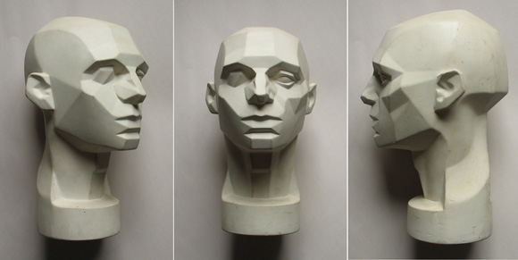


Thread w/ link to download photos from all angles.
Official site with merch and stuff.


I came across this at a time I realized I liked certain volumes and transitions in faces but lacked a way to pinpoint what was going on. It cemented the concept of understanding changes of direction in surfaces as planes and gave me an initial framework to creepily stare at faces for extended lengths of time in a quest for seeing those planes.

The way this sculpture is simplified into the most basic planes in a side is particularly nice, it shows how to build up volumes gradually without getting caught up in features. By no means it's perfect (there's no universal facial structure after all) and I don't like the way the neck was simplified but it's still a pretty good starting point.

If depicting volumes give you joy and you want to incorporate them in your style this is a nice way of approaching them in everything. And whether you'll play up the plane breaks or blend them in the loveliest soft transitions is up to your preferred stylistic flavors.


Lambert's Cosine Law

One aspect that mystified me was how sometimes you have a volume or protuberance getting gradually darker followed by a surprisingly bright area—nearly as bright as the things in first plane! Sometimes you'll see deep wrinkles surrounded by darker cheeks and noses and how can they possibly be brighter than the regions closer to the light source?! Sometimes you have a light source slightly to the side but the edge of the cheeks seem equally dark on both sides. How so?
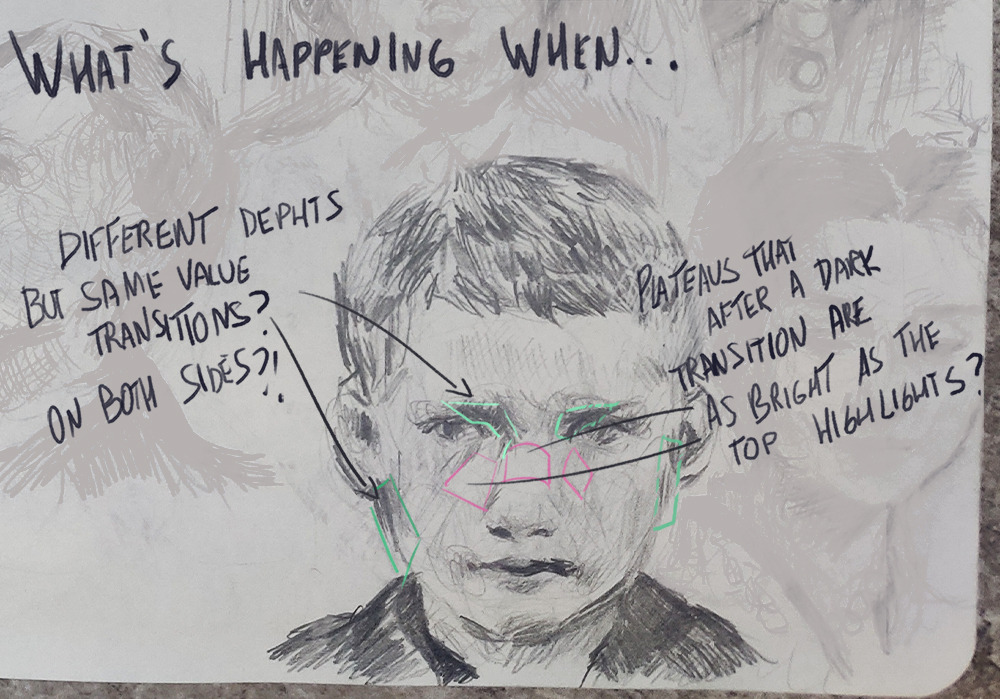


What's happening is that you got light rays missing the surface thanks to their angle. When you get fewer rays forced to cover a big area you end up with a darker region.
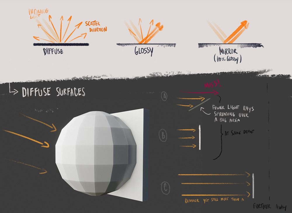


Under normal atmospheric conditions the amount of energy lost as the light travels through the air is smaller than the the perceived "loss" caused by steep angles. Light dims at a smaller rate than the distance between these points; things that are farther but perpendicular will receive more light and be brighter even after the loss of energy the incoming rays suffered.

Volume depends on light yet it can be useful to isolate the two for a moment. Think of volume as something created by the fill light: soft ambient light scattered in the air, usually from the sky. The way I go is to pretend there's a soft light in front-top of my subject to determine the volume then cast light and shadows from actual light sources on top of the initial "volumetric" shading.

I'm not going in depth about specular (glossy) highlights, but it's worth mentioning why they're so bright: They don't scatter as much, allowing more rays to return to your eyes. That's why they're only visible from some angles too.

So now you know why the sides are darker how do you know how dark you should go? That's where Lambert's formula itself comes in handy. Don't fret, I'm not going to inflict math on you!
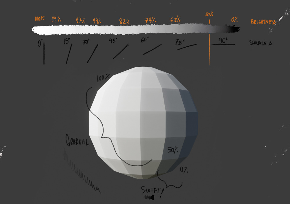


Matte objects aren't 100% diffuse but that's a good starting point to get to that volume-dependant shadows going. You don't need to remember the exact moment brightness dims to 50% or sweat over identifying angles (I don't!), simply remember it's not a 1:1 relationship (45º =/= 50% brightness) and that objects or regions away from the lights aren't necessarily darker.

By the way, I should mention I borrowed the light scatter example from James Gurney's blog (his post is about material finishes instead of using it for volume). His color and light work is phenomenal, making his blog is well-worth a visit.
« Last Edit: March 29, 2021, 09:39:16 AM by Songbird »

Buteo

  • Ranger
  • ****
  • Posts: 767
Re: The Forum's Art Museum
« Reply #2647 on: March 29, 2021, 02:28:49 AM »
Songbird, these are some astounding, enlightening, stimulating posts!

I haven't drawn in ages; it's discouraging when anything you draw looks exactly the same as the drawings you made decades earlier... but then, that's what happens when you don't draw, right? You have shown us some guidelines that can give me hope of seeing my skills develop, if I give them a chance.

Many, many thanks!

Songbird

  • Safe-Zone Citizen
  • **
  • 10g of fluff and pointy edges
  • Posts: 127
Re: The Forum's Art Museum
« Reply #2648 on: March 30, 2021, 02:04:11 PM »
@Buteo Glad to be of help! If you decide to give it a chance use the extended break to your advantage: This is a chance to look at old patterns with fresh eyes and break from unhelpful routines more easily. And whatever you do in the first days at least focus in indulging yourself. Draw what you want do draw, not what you feel you have to. Finding that little spark of joy again is far more satisfying and useful in the long run than following a Proper Art Regimen.


Time to make another offering to the gods of art. I never thought I'd enjoy drawing this sort of thing so much and look, I know they're a bit fishy but I feel I'm winging it alright!


My favorite, the peek-a-boo lil' buddy.


Here's the full spread. Phone is a potato and is artifacting photos taken from this distance.

Spoiler: show


Buteo

  • Ranger
  • ****
  • Posts: 767
Re: The Forum's Art Museum
« Reply #2649 on: March 30, 2021, 03:28:17 PM »
Fishy or not, you've given me something to be raven about!

That one image brought an old memory back:
"When an eel grabs your leg and the pain makes you beg, that's a moray
When those needles sink in to your foot or your shin, that's a moray..."

wavewright62

  • Valkyrie
  • Conqueror of an Abandoned City
  • *
    • Tumblr
  • Preferred pronouns: she/her
  • Posts: 5031
Re: The Forum's Art Museum
« Reply #2650 on: March 30, 2021, 03:33:49 PM »
I am here for this sketchbook!  Those are amazing fish and birds and ....wow.


I recently had a cleanout of old stuff and wanted to pitch some.  My daughter scavenged all the ones where I had thrown up my hands and drawn cartoon dragons and other beasties, and stupid captions.  (I'm talking about the sort of perspective studies you make in art class, drawing buildings and the like, or the teacher who put together ugly & absurd still life collections to instill 'a pretty subject does not make a pretty picture'.  Those are just begging for flaming jellyfish, y'know?)
Always a newbie at something
Native speaker: :us:
Acquired: :nz:
Grew up speaking but now very rusty: :ee:


Ruler of Queenstown Airport (Thanks Purple Wyrm, I will wear my wings with pride)
Admiral of the Sunken Rainbow Warrior

Keep Looking

  • Bragi
  • Ruler of a Derelict Airport
  • *
  • Preferred pronouns: she/her, they/them
  • Posts: 1170
Re: The Forum's Art Museum
« Reply #2651 on: March 31, 2021, 08:24:29 AM »
I've been doing a lot of school-related things lately but one of those school-related things is making this stupidly big oil painting for my art course. It's a self-portrait and painting it has amplified every one of my narcissistic qualities right up until the point where I had to paint that stupid fern clump. Hot tip: painting ferns is awful. It's a nightmare. They're so fiddly. Don't paint ferns. There's another, bigger, fern clump that I haven't painted yet and it fills me with dread.

As you can see, the painting is incomplete, but it is coming along nicely. There will be vine stems and things filling up a lot of the blank black space but those haven't been painted yet as I am doing the leaves first.


My oil painting technique is called 'make it up as you go along' and so far it has served me well.
I write poetry sometimes.

Icon by the amazing Rithalie from the SSSS discord (rithalie-art.tumblr.com)

Ruler of Changi Airport

Sevseres

  • Newbie
  • *
  • Preferred pronouns: she/her
  • Posts: 80
Re: The Forum's Art Museum
« Reply #2652 on: March 31, 2021, 09:11:21 AM »
XoX It's already gorgeous! Those ferns indeed look dreadful but they look real nice too.
native: :tr: okay: :gb: learning: :se: :fr:

HEY! my nickname used to be nefnef, dont be confused :p

Songbird

  • Safe-Zone Citizen
  • **
  • 10g of fluff and pointy edges
  • Posts: 127
Re: The Forum's Art Museum
« Reply #2653 on: March 31, 2021, 10:17:28 AM »
Buteo Old memories for some, something entirely new for others! And being a non-native anglophone I have the strong suspicion there's a phonetic pun somewhere there I can't find it :x

wavewright62 Throwing out old art? Check!
I had two brief brushes with formal art education in university. Unfortunately they weren't very enlightening. I've recently thrown away nearly everything produced at the time—the drawings of my own volition made before that time, those I kept.

Keep Looking Wow this look amazing and I love love love those greens. If it helps ferns create so much visual noise that once together it's hard to say where full improvisation kicked in. I'm looking forward to seeing the finished piece!

moredhel

  • Ranger
  • ****
    • DeviantArt
  • Preferred pronouns: happy with any of them except it
  • Posts: 619
Re: The Forum's Art Museum
« Reply #2654 on: March 31, 2021, 10:27:18 AM »
Keep Looking, I really like your Painting. And my wife says it is very beautiful.

We both say, when painting ferns Asplenium scolopendrium may be the clever choice.